29 April 2006

Queen's Day (Amsterdam)

Today the streets of Amsterdam was coloured 'Orange' in celebration of Queen's Day.

Queen's Day is basically an excuse to Party. The whole city was like a giant concert with streets full of crazy dancing people. An event worth visiting once atleast (and many times if you are a beer-fan).

15 April 2006

Cubes and Kunsthal

Day 6 -

Last day of traveling, I need to get to work now for all the projects and reviews that are coming up. So once again a bit of Rotterdam seeing.

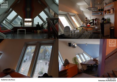
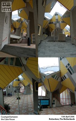
Here's what the Cube houses look like on the insides (Inside the courtyards and inside the units).

One of the units is now a Museum, I have only two things to say about them -1. It's bigger that it looks from the outside 2. It's extremely disappointing.

The house inside is extremely conventional and the architect didn't in any way use the potential of the inclined surfaces to make the house experientially interesting. It an ordinary crammed house but with inclined outer walls. Simply saying boring.

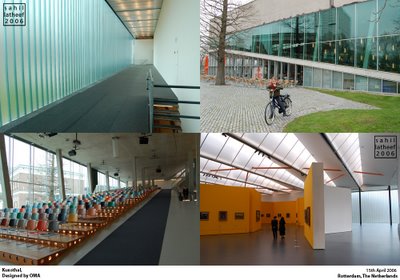
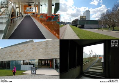
And lastly, yet another great OMA project- Kunsthal - buildings like this makes me think that Rotterdam is a great place after all.

In this building of Galleries Rem and his team at OMA explore new spaces and experiences through very simple techniques.

However, the most interesting element of the building is the fact that the building itself is almost cut into two halves by a public street that passes through it connecting the Museum park behind it to the main street in front of the building.

By this simple juxtaposition of two extremely contradicting functions the building has a strange dialogue with its context.

14 April 2006

Almere and more..

Day 5 -

After one day of break for School and also for body I was back on the move. A today took me to a suburb of Amsterdam, actually an ex-suburb now almost a sprawling city and towards the end of the day to Amsterdam itself.

Almere was founded in the early 80's as a suburb of Amsterdam (some 20 minutes from there by train) on newly reclaimed land and the city grew rapidly in a sort of uncontrolled fashion until the early 90s, when the local government understood the potential to develop the place as another city rather than a suburb and commissioned OMA to design a new City Centre, since the earlier one was not designed or structured in anyway and generally formed around the Centraal station.


OMA proposed and eventually executed (above pics) the Masterplan for the New City Centre that elevated the central area to keep the cars off the main pedestrian shopping core and but all the major infrastructure below.

Like many other Dutch cities in the 90s Almere too used architecture especially by 'famous' firms to promote itself. Though this may seem like a good idea it sometimes greats a ugly collage of supposedly good buildings or something even worse - just plain ugly buildings - like this one (above) by the English firm of architect Wil Alsop.


However, there are a few interesting projects, like this Apartment building by Claus en Kaan architects. Check the website of this dutch firm at http://www.clausenkaan.com/index_NS.html (they have some interesting but very conventional Housing projects).

And 2 more images from a suburb of Almere (if the idea being a suburb of an suburb didn't tickle you check this out).This (below) is Rainbow, and believe me I didn't make up that name for the place.

I guess the builders and architects of these otherwise interesting housing units pushed their luck too far with the colours.

Even the streets are named after colours or tones (Like this one in the above right corner was 'Sepia' street). And for some time now I been worried that Europeans and especially the Dutch don't have a sense of humor. Though I wonder what it would mean for kids growing up here.

Now colour blind, I headed for Amsterdam and to see a 'real' suburb. Here's a few images (below) of crazy CIAM buildings in southern Amsterdam in Arena.(Arena is famous for the big football stadium, very close to these humongous buildings)

These buildings actually snake around almost a length of a Km each with huge open spaces (so-called gardens) in between. Architecture can really be scary.

12 April 2006

Meanwhile in Rotterdam

Day 4-

But I do have college to attend, so back to Rotterdam.

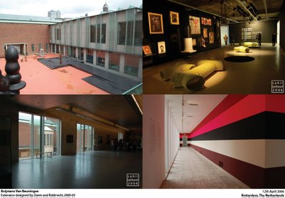
Theres a lot here that I haven't seen or at least shared with all you out there. So here's more of this city. I have to admit that I was a bit ashamed to admit that I had not seen of the city's major museum's yet. But not for much longer. Here's some images from the main Museum of Rotterdam.


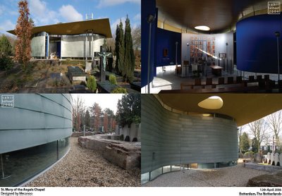
And below a few snaps from a small chapel designed by Dutch firm Mecanoo (Famous for the Delft University library that I posted earlier).

This small but strange formed chapel sits inside of the city's largest cemetrys'. The weird plan is squashed into the footprint of an old church that existed here long back (a few layers of brick clearly outline it's past)

11 April 2006

Kröller-Müller Museum

Day 3 -

The Kröller-Müller Museum and sculpture Garden deep inside the Hoge Veluwe National Park has to be one of the best Museums that I have been to for many reasons.

The art works are great, the buildings and Pavilions are great too and the site and setting couldn't be better. If an hour of cycling (from the main entrance to the Museum) through some of the most serene Dutch landscapes wasn't enough the art collection is worth more than what I can describe.


And then there are the great pieces of Architecture. The next two slides show pavilions by two famous Dutch architects that were actually not designed for this specific site, but were based on earlier pavilions designed and executed by them elsewhere (the original version however, where demolished after the respective functions were fulfilled).


The first one (above) designed by Rietveld, is more a piece of sculpture itself. One can see his strong De-stijl approach here.


Meanwhile the next one, rebuilt here very recently, is much more dynamic in what the architecture has to offer to the users of the space vis-a-vis their interaction with the pieces of art. Here the architect Aldo Van Eyck (who was also a member of Team 10) forces the users to think and act differently to the sculptures making it a very interesting experience.

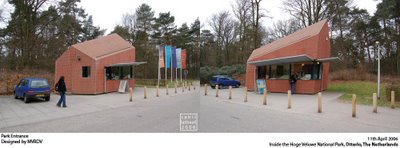
And lastly(below), far away from the Museum and sort of back in the real world I saw this crazy entrance gate to the National Park designed by none other that the energetic practise of the trio of MVRDV.


10 April 2006

Utrecht revisited

Day 2 -

The mission was clear - to see everything in and around Utrecht in one day.

Not an easy task even for me, considering the amazing architecture of the University, the cute canals and streets of the city centre and an old castle in the outskirts of the city. But as they say where there's a will there is a way.


So we started off the day at the University following of a sort of sequence of what we see first. Most of these projects have been posted before so I'll just put a few new angles or insights.

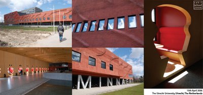
Above is a snap of the inside of the famous 'Minnaert' building and as far as I know it houses a small Library (small in comparison to the main), a canteen and a few Laboratories. The interior photo was clicked in the main lobby of the building on the first floor from where one has to access all the functions. The small red niches provided students with a smaller more intimate space within this monster of a building.


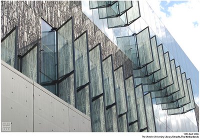
Here's one snap of the Exterior of Weil Aret's Library Master-piece that I have extensively covered earlier last year.

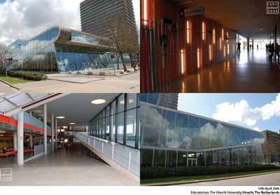
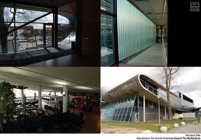
And lastly from the University yet another Master-piece by Rem Koolhaas and OMA. The "Educatorium" not only has a cool name, but also spaces to compliment it inside.

Here you can see all the signature moves of OMA put in practice to create a seamless beauty of amazing visual and spatial quality.


Now I think back about the Villa VPRO of MVRDV (also posted on this blog some while ago) and realise it's uncanny similarity to the ideas that Winny and gang picked up at OMA. But I guess as they say 'if the copy is good, than it's OK to copy'.

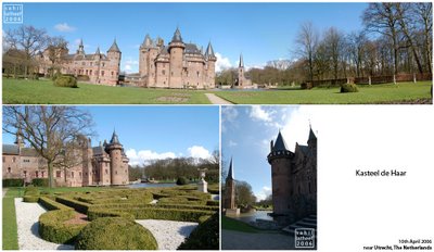
After an exhaustive run of some of the great buildings I have ever seen, we headed out to the outskirts of Utrecht in search of one of the many Castles that dot the Dutch countryside.


Kasteel de Haar, has a surreal quality about itself. A sort of Medieval Castle in the flat landscape of the dutch countryside and to add to it the French garden on one side and a English Garden on the other. It was like a catalogue of European History (a very small one I must add). Confusing, but very nice surprise in this rigidly structured country.

After that we headed back into the city and a stroll along the canals in the centre later I headed back to Rotterdam.

09 April 2006

Touring the Netherlands

Day 1-

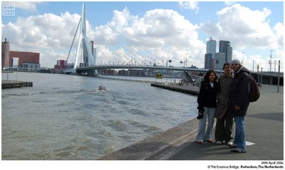
Under the pretext of Neha* and Pragya's visit to the Netherlands I took this advantage to see the Netherlands parts that I had already and some that I hadn't properly, but not soo much as a tourist but more as a guide.


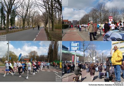
And lucky for them the first day of their visit was an exciting day in otherwise boring Rotterdam, with the city placing host to an important sports event - the annual Rotterdam Marathon.


If only for a day the city completely transformed into a lively environment. Hopefully, this is what Spring will be like here :)

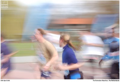
I've been planning for such a panning shot since long but never managed it. So happy to get my first one.

And the last set of the day shows my only strong connection to Bollywood - the few Indian stalls in the local weekend market, selling all the latest movies of Bollywood - Pirated of course (for only 2 Euros a DVD, cheaper than back in Mumbai - wow).


And one more panning shot.
(* - Neha was here too short)

A Google map tracing my travels across the globe


View Larger Map
  • In Red cities where I have lived (more than one month);
  • In Blue cities that I have visited