Finally here we were at the 2010 World Expo the main reason why we were in China right now...
 .. and as expected we spend a large portion of the day in queues...
.. standing...
 ...siting...
 ....and getting misted... :-)
But from what we are hearing we were really lucky.. the worst line we stood in was less than an hour long.. this event has become notorious for the long queues outside each country pavilion some as long as 4 to 5 hours long.
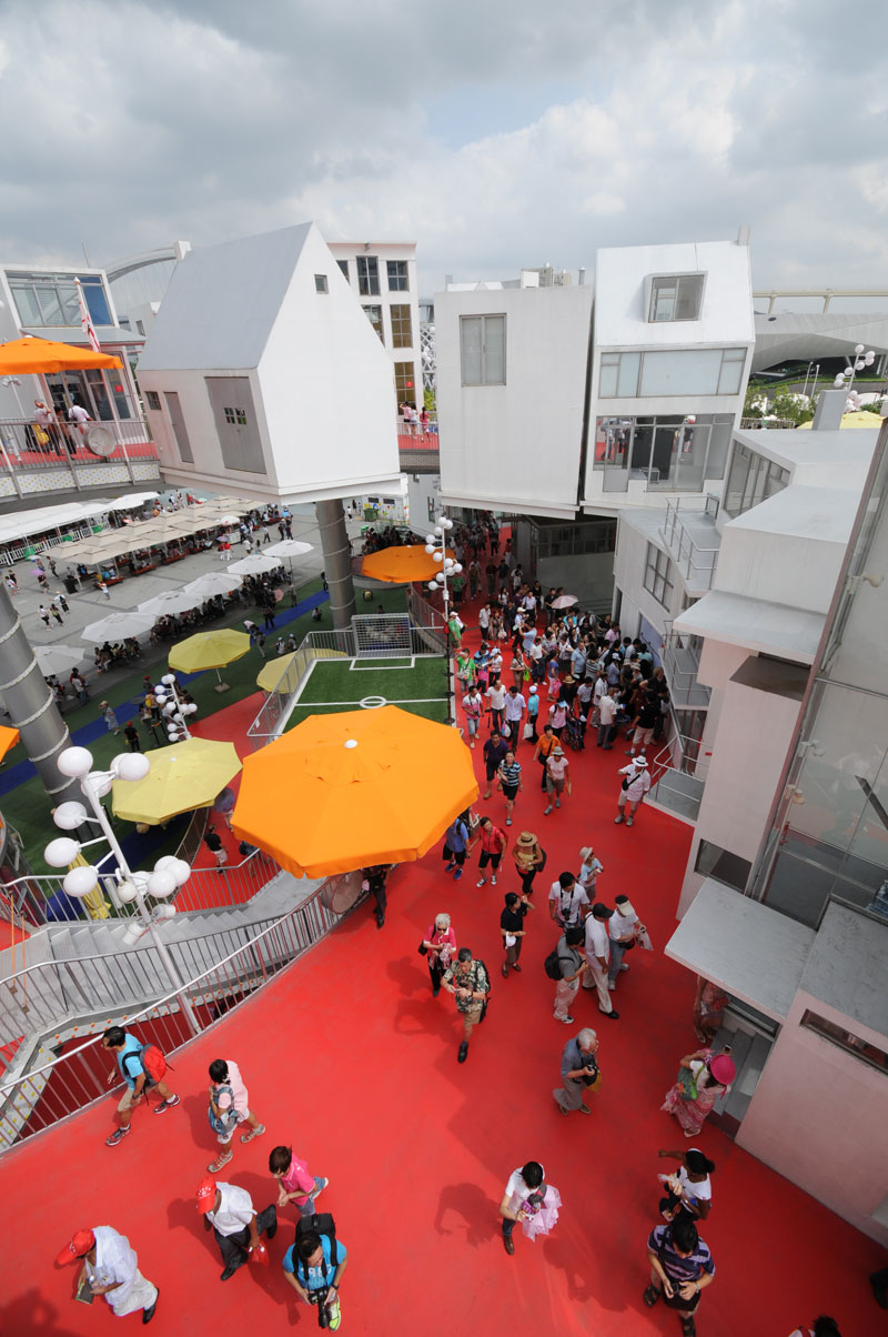
After spending the whole day we saw quiet a bit of this gigantic expo but were far from seeing all the pavilions.. Below is a selection of some of the most interesting and some of the most horrible pavilions on display for a few months here in Shanghai..
Probably the most striking one was the one we started the day with The UK Pavilion (aka the Seed Cathedral) designed by Heatherwick Studio


 There was a lot of hype about this pavilion online but I would say it lived up to it, its alien form sitting in a crater like landscape was very successful at dealing with a non nonsensical brief of creating a pavilion that represents a country and displays almost nothing at all...

 Next stop was The Dutch Pavilion designed by John Kormeling.


 In a lot of ways the pavilion is truly Dutch in its spirit. Tongue-in-cheek and almost making a farce of the expo theme of 'Better city better life'
 'The Happy Street' pavilion was a collage of a lot of Dutch architecture/innovation/design that was blend into a continuous ramp like street that was topped by a yellow crown that related the famous Cube houses of Rotterdam to the popular Chinese lotus flower motif ..
 Next up was the one of the building that captured the architectural society imagination the most- the highly anticipated Danish Pavilion designed by BIG (in collaboration with Arup and 2+1).


 Like all buildings designed by Bjarke Ingels its extremely diagrammatic.. a simple loop path that warps around an open court which housed Denmark's most iconic image - the Little Mermaid Statue from Copenhagen - for the whole duration of the Expo.


 Next was the Spanish Pavilion designed by Benedetta Tagliabue.


 The main attraction in this pavilion was Miguelin the giant baby 'conceived' by Spanish director Isabel Coixet.
 ... then The German Pavilion in Shanghai designed by Schmidhuber + Kaindl GmbH..
 .. here we heard there was a 2 hour long line so we decided to give it the skip..
  The Mexican Pavilion designed by Mexican architects SLOT was the most interesting pavilion among the lesser celebrated ones..
 It had a simple idea which was executed beautifully.. the pavilion hid itself below a lawn with kite like canopies.. it was a welcome break away from the 'look-at-me' pavilions all fighting for there few months of glory..
 Right next to the Mexican was the extremely architectural driven Chilean Pavilion named “Sprout of a New City” was designed by Sabbagh Arquitectos.
 The exhibits inside this pavilion seems to have been geared completely to address city makers on how the field of architecture could save the world.
 The Swiss pavilion designed by Buchner Bründler Architects was a bit of a disappoint, it didn't help that the famed cable car of this pavilion was not functioning today :-(
 The Canadians didn't bother with architects for their Pavilion design.. it was imagined and designed by Cirque du Soleil and built by Canadian firm SNC-Lavalin Inc.
 but for that matter it wasn't a complete disaster.. sadly we missed all the shows that Cirque du Soleil was conducting at the theater here..
 The most interesting of the Asian pavilions was the very dutch Korean Pavilion designed by Mass Studies.


 Moving on to the lesser interesting pavilions...
The Luxembourg pavilion designed by Francois Valentiny.

 The dune inspired UAE Pavillion designed by Foster + partners.


 The World Expo Cultural Center designed by ECADI (East China Architecture Design & Research Institute).
 The next one was strangely the second most popular pavilion of the expo (of course you cannot beat the Chinese pavilion in an event in China) - the Saudi Arabia Pavilion was a combined effort by Chinese and Saudi designers -
 and its key attracting feature was not its exhibits nor its architecture but rather their freebies (apparently they had the best things to handout) :-)
Below is the Israeli pavilion designed by Haim Z. Dotan.
 Now moving to the worst pavilion in terms of design and innovation ...
Starting with the horrible Indian Pavilion this was designed by an ad agency - Hindustan Thompson Associates Pvt. Ltd - and felt like a poorly designed stage set..

 It tried to capture a whole bunch of cliched notions of India and was really sad!!
  Not far behind on the worst pavilions list was our beloved neighbors.. The Pakistan Pavilion was a replica of the Fort in the city of Lahore.
 and to complete the list of the least innovative was our other neighbor...the Nepal Pavilion with the theme “Tales of Kathmandu City” tried to replicated a historic quarter of Nepal.. In some ways in its naivety it was a much more sincere effort..
 And to end my post from this mega event of architectural madness, last but not the least, the massive Chinese Pavilion designed by Chinese architect He Jingtang

 It takes off as a play on a traditional Chinese pavilion typology but thru its scale and placement completely dominated the gigantic expo site..
 It would have been great to see this from the inside but that would mean we spend a whole day in trying to get in.. sadly that wasn't a luxury we could afford..
All in all it was a very interesting (albeit tiring) day.. It's was like an interesting class on contemporary architecture...
Tomorrow we trying to see more of Shanghai before we move to other cities..
 .. and as expected we spend a large portion of the day in queues...
.. standing...
 ...siting...
 ....and getting misted... :-)
But from what we are hearing we were really lucky.. the worst line we stood in was less than an hour long.. this event has become notorious for the long queues outside each country pavilion some as long as 4 to 5 hours long.
After spending the whole day we saw quiet a bit of this gigantic expo but were far from seeing all the pavilions.. Below is a selection of some of the most interesting and some of the most horrible pavilions on display for a few months here in Shanghai..
Probably the most striking one was the one we started the day with The UK Pavilion (aka the Seed Cathedral) designed by Heatherwick Studio


 There was a lot of hype about this pavilion online but I would say it lived up to it, its alien form sitting in a crater like landscape was very successful at dealing with a non nonsensical brief of creating a pavilion that represents a country and displays almost nothing at all...

 Next stop was The Dutch Pavilion designed by John Kormeling.
 In a lot of ways the pavilion is truly Dutch in its spirit. Tongue-in-cheek and almost making a farce of the expo theme of 'Better city better life'
 'The Happy Street' pavilion was a collage of a lot of Dutch architecture/innovation/design that was blend into a continuous ramp like street that was topped by a yellow crown that related the famous Cube houses of Rotterdam to the popular Chinese lotus flower motif ..
 Next up was the one of the building that captured the architectural society imagination the most- the highly anticipated Danish Pavilion designed by BIG (in collaboration with Arup and 2+1).


 Like all buildings designed by Bjarke Ingels its extremely diagrammatic.. a simple loop path that warps around an open court which housed Denmark's most iconic image - the Little Mermaid Statue from Copenhagen - for the whole duration of the Expo.


 Next was the Spanish Pavilion designed by Benedetta Tagliabue.

 The main attraction in this pavilion was Miguelin the giant baby 'conceived' by Spanish director Isabel Coixet.
 ... then The German Pavilion in Shanghai designed by Schmidhuber + Kaindl GmbH..
 .. here we heard there was a 2 hour long line so we decided to give it the skip..
  The Mexican Pavilion designed by Mexican architects SLOT was the most interesting pavilion among the lesser celebrated ones..
 It had a simple idea which was executed beautifully.. the pavilion hid itself below a lawn with kite like canopies.. it was a welcome break away from the 'look-at-me' pavilions all fighting for there few months of glory..
 Right next to the Mexican was the extremely architectural driven Chilean Pavilion named “Sprout of a New City” was designed by Sabbagh Arquitectos.
 The exhibits inside this pavilion seems to have been geared completely to address city makers on how the field of architecture could save the world.
 The Swiss pavilion designed by Buchner Bründler Architects was a bit of a disappoint, it didn't help that the famed cable car of this pavilion was not functioning today :-(
 The Canadians didn't bother with architects for their Pavilion design.. it was imagined and designed by Cirque du Soleil and built by Canadian firm SNC-Lavalin Inc.
 but for that matter it wasn't a complete disaster.. sadly we missed all the shows that Cirque du Soleil was conducting at the theater here..
 The most interesting of the Asian pavilions was the very dutch Korean Pavilion designed by Mass Studies.


 Moving on to the lesser interesting pavilions...
The Luxembourg pavilion designed by Francois Valentiny.

 The dune inspired UAE Pavillion designed by Foster + partners.

 The World Expo Cultural Center designed by ECADI (East China Architecture Design & Research Institute).
 The next one was strangely the second most popular pavilion of the expo (of course you cannot beat the Chinese pavilion in an event in China) - the Saudi Arabia Pavilion was a combined effort by Chinese and Saudi designers -
 and its key attracting feature was not its exhibits nor its architecture but rather their freebies (apparently they had the best things to handout) :-)
 Below is the Israeli pavilion designed by Haim Z. Dotan.
 Now moving to the worst pavilion in terms of design and innovation ...
Starting with the horrible Indian Pavilion this was designed by an ad agency - Hindustan Thompson Associates Pvt. Ltd - and felt like a poorly designed stage set..

 It tried to capture a whole bunch of cliched notions of India and was really sad!!
  Not far behind on the worst pavilions list was our beloved neighbors.. The Pakistan Pavilion was a replica of the Fort in the city of Lahore.
 and to complete the list of the least innovative was our other neighbor...the Nepal Pavilion with the theme “Tales of Kathmandu City” tried to replicated a historic quarter of Nepal.. In some ways in its naivety it was a much more sincere effort..
 And to end my post from this mega event of architectural madness, last but not the least, the massive Chinese Pavilion designed by Chinese architect He Jingtang
 It takes off as a play on a traditional Chinese pavilion typology but thru its scale and placement completely dominated the gigantic expo site..
 It would have been great to see this from the inside but that would mean we spend a whole day in trying to get in.. sadly that wasn't a luxury we could afford..
All in all it was a very interesting (albeit tiring) day.. It's was like an interesting class on contemporary architecture...
Tomorrow we trying to see more of Shanghai before we move to other cities..
No comments:
Post a Comment