We first headed to see Jean Nouvel's Foundation Cartier where the external façade was designed as a glass screen running parallel to the boulevard and would prolong it’s perspective.

 From there we went to see the Bibliotheque Nationale.

 My sis was in disbelief that this massive complex of 4 identical 'open book' towers and its huge forested courtyard was all one huge library!


 The stop was Corbusier's Cité de Refuge.
 This project was the great master's first opportunity to create accommodation for the urban poor.
 The compact site provided the chance for a radical approach both to bringing in light and space and to laying out the entrance halls to accommodate the Salvation Army's reception process.
 However we didn't feel very safe around there with my camera and stuff and made a quick dash out of there
 catching the closest metro straight to the Louvre museum.
 If you've been reading my blogs you would know how big a fan of I M Pei I am.

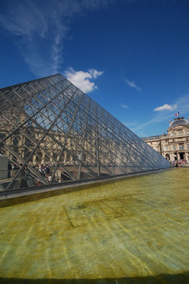
 His extension and new entrance halls to the Louvre is undoubtedly a great piece of architecture yet there is something horribly wrong with its symbolism.
 Though like in his other buildings I love his choice of materials and its beautiful detailing, I am unable to agree with its overall form.
 Yes I like the idea of the non-building
 (everything neatly tucked away below the huge plaza),
 yes I like the generosity of it's entrance spaces,
 yes I like how he has dealt with proportions as one sequentially enters the original Palace but the Glass Pyramids I do not get!
 And clearly it isn't the glass that's bothering me.
 (I have added only one photo of the inside of the museum - the one above- clicked at the Mona Lisa exhibit to show the sheer amount of people who are in here everyday of the year! It's really crazy..)
 How or rather why did Pei use the Pyramid so literally here. Yes, I am aware of his inclination towards this geometry but surely this wasn't the right place for using it soo purely - Or is it?

 From there we went to see the Bibliotheque Nationale.
 My sis was in disbelief that this massive complex of 4 identical 'open book' towers and its huge forested courtyard was all one huge library!

 The stop was Corbusier's Cité de Refuge.
 This project was the great master's first opportunity to create accommodation for the urban poor.
 The compact site provided the chance for a radical approach both to bringing in light and space and to laying out the entrance halls to accommodate the Salvation Army's reception process.
 However we didn't feel very safe around there with my camera and stuff and made a quick dash out of there
 catching the closest metro straight to the Louvre museum.
 If you've been reading my blogs you would know how big a fan of I M Pei I am.
 His extension and new entrance halls to the Louvre is undoubtedly a great piece of architecture yet there is something horribly wrong with its symbolism.
 Though like in his other buildings I love his choice of materials and its beautiful detailing, I am unable to agree with its overall form.
 Yes I like the idea of the non-building
 (everything neatly tucked away below the huge plaza),
 yes I like the generosity of it's entrance spaces,
 yes I like how he has dealt with proportions as one sequentially enters the original Palace but the Glass Pyramids I do not get!
 And clearly it isn't the glass that's bothering me.
 (I have added only one photo of the inside of the museum - the one above- clicked at the Mona Lisa exhibit to show the sheer amount of people who are in here everyday of the year! It's really crazy..)
 How or rather why did Pei use the Pyramid so literally here. Yes, I am aware of his inclination towards this geometry but surely this wasn't the right place for using it soo purely - Or is it?
No comments:
Post a Comment