The most iconic contemporary architectural project in Porto (and probably in Portugal) is Casa da Musica (CdM). This is the main concert hall of the city and its design was selected thru an international competition in 2001 when Porto was selected as one of the capitals of European culture.

The project was designed by dutch architectural firm - OMA and is truly an 'architectural adventure' (as claimed by them). The overall form of the project is derived by 'programmatic stacking', two highly simplistic shoe-box concert halls (supposedly the best from for optimal acoustic performance) were stacked and all the other public programs were added onto these boxes.

The residual spaces between the public functions and its enormous outer skin were filled up with secondary serving spaces, such as foyers, restaurant, terraces, technical spaces and vertical transport.
The continuous route

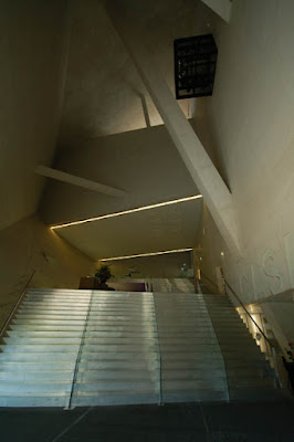
As a user of the building its most interesting aspect is the continuous route running around/thru it that connects all functions and ‘remaining spaces’ by stairs, platforms and escalators.

This is not the first time that OMA has explored this idea of the continuous route - it first appeared in their unbuilt project for the Hilton hotel in Den Haag way back in 1990 and has since appeared in many designs (both as built and unbuilt projects). To name a few projects that use this idea - Kunsthal in Rotterdam (1992); Educatorium in Utrecht (1997); and Seattle central library (2005). But sadly the most extreme/complete version of this idea went unbuilt as the Jussieu Library in Paris (1992).

As compared to any conventional concert hall the use of the circulation loop at CdM creates many new possibilities of its use and is especially valuable during large festivals when it can easily adapt to simultaneous performances.
Materiality
The other striking feature of this building is its choice of materials. Each of the key spaces in the building is render with a completely different material and colour palate thus giving them an illusion of complete autonomy, adding to its sense of adventure. The following photos show this wide array of materials:

This space covered in hand painted tiles is one of the many in the building that can be used for small gatherings or informal rehearsals;

this smaller room uses the more traditional portuguese - 'blue tiles' (with paintings depicting religious themes);

this one is covered in a very spongy acoustic panels [which is amazing to run into : ) ];

the main auditorium is cladded with plywood panels that are embossed with a gold-leaf pattern that is an enlargement of the grain of the plywood itself;

different sorts of ionised and aluminium plates clad circulation floors and walls ;

here's another space with hand painted tiles, this time it's outdoor and has a great view of the Rotunda da Boavista;

the right colour and texture for the slanted concrete walls was apparently selected after six months of tests and was achieved by mixing Portuguese portland-cement with a particular blue sandstone that will whiten in time;

but the most memorable of all the material choices within CdM is its use of wave-like corrugated glass 'curtains' through which each space reveals its contents to the city.
Contextual?


- even shy to land itself properly -

on its free-flowing Travertine-clad plaza (made for skateboarders, rollerbladers and bikers);


and strangely makes it extremely contextual.


No comments:
Post a Comment